
DAEDRIC FUN TIP:
Always heed the Daedric Fun Tip.
6936: argonian artist:GrizzlyBear artist:Kazerad character:Quill-Weave knock_off text

|
- Reply
GrizzlyBear: Wasn’t gonna post this at first, because it’s not very original and I just wanted to see the outfit with the colors applied. But KuroNeko wanted to see it and I saw no harm, so here it is.
Rick2tails: looking sexy Quill!
KuroNeko: Yay, you uploaded it :)
Nice colors, I like the shade of red you used, fit better than in mine I think.
- Reply
GrizzlyBear: @KuroNeko: Thanks! I felt the same way about your red. It looked more velvety, which I like
APayne1776_2: Woo! to you too
|


6935: artist:lapma butterflies character:Katia_Managan elsweyr magnus pig wallpaper

|
KNOWNvictor: mood
|

6932: Cosplay argonian armor artist:KuroNeko character:Quill-Weave

|
showing 10 of 13 comments
Caps: That metroid Armor looks amazing!
Also, Jeez. I have been looking where that outfit is from but I couldn´t find anything. Is it a reference to Samus clothes?
KuroNeko: @Caps: The armor color scheme is indeed a metroid reference but it was added by me when I colored it.
Both the armor and Quill's clothes are referencing the same thing and it's Prequel related.
Caps: @Kuroneko I think I have finally found it. It is the dress concept that Katia left for Quill before she left to Kvatch.
https://www.prequeladventure.com/2011/07/katia-revise-letter/
bluedraggy: Aw. You gave it away. But yup!
Caps: @Bluedragy
XD Thanks for the challenge. it helped me to pass the time. ; P I have been searching through everywhere for it. Through Kaz´s tumblr, Prequel´s facebook, and even I went to the old forums where this webcomic used to be first to see if it was something like a fanart made by someone (including the forum of MS Paint Art to see if I could find anything). I searched in the catalog of the comic bu I though I searched all of it. Well, sorry if I´m giving to much info. But I really enjoyed this mini treasure hunt. ; )
- Reply
GrizzlyBear: I literally just got finished coloring that old sketch in before I saw this. Yours looks a lot better though
KuroNeko: @GrizzlyBear: I'm impressed someone actually remember that sketch. I hope you will post yours here too.
- Reply
GrizzlyBear: @KuroNeko: Wasn’t planning on it. All I really did was trace the drawing and color it in to see how the outfit would look with the colors applied. I just think it’s a crazy coincidence that we thought of it at the same time
|

6934: argonian artist:KuroNeko character:Quill-Weave hats monochrome very_casually_underdressed


6931: artist:_Caps character:Katia_Managan knock_off pixel_art skooma_is_a_hell_of_a_drug

|
Caps: I have been drinking lately with some friends through video chat.
I really miss to go out.
madmanransom: Hero of Kvatch, I kid you not. She turns herself into a hotdog. She's called Hotdog Katia. Funniest shit I've ever seen.
Caps: @Lapma Only the hottest of cats with all the condiment of your desire just for you, sir. ; )
@Madmanransom XD That´s really good. From now on, I declare that she will be called Hotdog Katia. ; ) @Un_Mapache Yes, it is!!! Now, if you don´t send this to 10 other people before tonight, at 12:00 AM. You will be transform into a hotdog!!! @Kuroneko Well, I´m glad you found it funny. ; ) |


6930: Katia's_wizard_robe accidents_happen anvil artist:lapma black_eyes casually_underdressed character:Katia_Managan comic criminal_scum death imminent_death magnus painted_underwear pig text wall-sword

|
Rick2tails: thats too dark for Katia ;p
semiafro007: You're always gonna have problems lifting a body in one piece. Apparently the best thing to do is cut up a corpse into six pieces and pile it all together.
And when you got your six pieces, you gotta get rid of them, because it's no good leaving it in the deep freeze for your mum to discover, now is it? Then I hear the best thing to do is feed them to pigs. You got to starve the pigs for a few days, then the sight of a chopped-up body will look like curry to a pisshead. You gotta shave the heads of your victims, and pull the teeth out for the sake of the piggies' digestion. You could do this afterwards, of course, but you don't want to go sievin' through pig shit, now do you? They will go through bone like butter. You need at least sixteen pigs to finish the job in one sitting, so be wary of any man who keeps a pig farm. They will go through a body that weighs 200 pounds in about eight minutes. That means that a single pig can consume two pounds of uncooked flesh every minute. Hence the expression, "as greedy as a pig."
APayne1776_2: Just like in RDR2
|


6925: Blade Kvatch_arena_armor adorable artist:lapma character:Katia_Managan criminal_apple monochrome pig text

|
lapma: A little followup to the Pet picture i have made few days ago.
https://www.prequeladventure.com/fanartbooru/post/view/6905 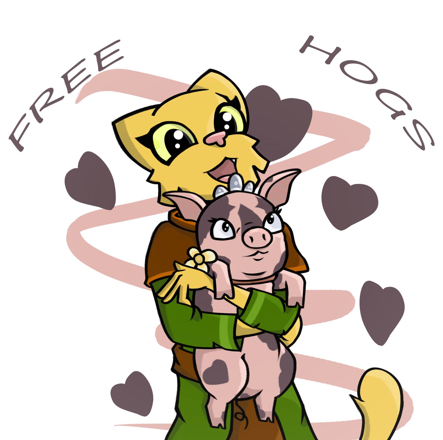
|

6924: artist:TempIntel character:Katia_Managan khajiit_racism monochrome sickly text

6923: artist:TempIntel casually_underdressed character:Katia_Managan questionable
|
- Reply
TempIntel: @lapma I was split between making a pineapple joke or keeping with the theme. I chose the egg XD.
Rick2tails: such a cutie!!
|
6938: artist:lapma casually_underdressed character:Katia_Managan dwemer_automaton dwemer_technology fear khajiit_body_language khajiit_racism painted_underwear
- Reply
- Reply
- Reply
- Reply
- Reply
Quickly Katia, onto a table, chair or worktop. That's the only way you'll be safe.